Sunday, November 22, 2009

A Parisian Evening


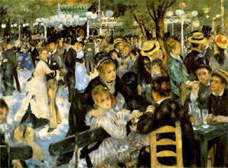
Pierre Auguste Renoir, Ball at the Moulin de la Galette, 1876, oil on canvas


This image depicts a day in the life of a Parisian evening at the famous dance hall in 1876. Couples dancing, groups talking and drinks flowing, Ball at the Moulin de la Galette portrays one of Renoir’s most favorite subjects.

The bodies and faces of the subjects are muddled but this was part of Renoir’s technique, not a flaw. As an impressionist painter, he worked closely with Claude Monet and their influence upon each other is obvious. Renoir was interested in the patterns and shapes light makes as it catches his subjects dancing about and socializing.

Splotches of diluted color or extra saturated color make patterns on the faces and elegant outfits. The splotchy technique that Renoir loved to experiment with creates this mood of intimacy where the viewer simply sees figures instead of individual characters. It is just as a viewer from a block away would see this image in the present time of 1876.

The faces and individual people are less important than the impact of the entire group of young, fun Parisians. In Renoir’s use of his “rainbow palette” the painting still has dimension and life which, otherwise, would have had a good possibility of being obsolete because there is no interesting or clear central figure.

Shades of pink-reds, dusty blues and charcoal create an image full of life. In Renoir’s great artistic ability, he could turn an unclear depiction of social life into a piece full of buzz and conviction.

His friends, being some of the subjects in the painting, act as Renoir’s more decipherable figures in the painting. Also in focus are the city light poles.

Just as the light defines the technique and mood of the painting, so do his friends. A social scene rooting at the core of the painting, Renoir’s friends are also part of this root.
Sunday, November 15, 2009

No beginning. No end.


Jackson Pollock, Number IA, 1948, oil on canvas

Pollock is a true innovator in the art world. Although violent in method, and also said to be violent in person, he gave an entirely new light to the already popularized method of Abstract Expressionism.

The piece says chaos and drama and evokes an unmatched feeling of pandemonium that you simply can not look away from.

This technique he created is called Action Painting and allows Pollock himself become a part of the painting by pouring and flinging paint onto an unstretched canvas with sticks or knives. The technique ultimately creates an entanglement of lines and blotches almost like a bundle of nerves in your brain all perfectly color coded.

The color palette, in itself, is dark and austere. The only color that really stands out from the giant cluster is the smears of rust on the bottom left.

A mere splash of color, the rust offers life into an otherwise monochromatic painting. Monochromatic should not be confused with dull however seeing that this painting is full of emotional expression and freedom.

Pollock was quoted as saying, “I want to express my feelings rather than illustrate them…I can control the flow of paint: there is no accident, just as there is no beginning and no end.”

Pollock didn’t need to represent his dark emotions by drawing a figure drinking in a dark room alone. Instead, with abstract lines and curves he created a similar emotion in a much more subdued way.

Pollock’s seemingly troublesome life ended in 1956 in car crash. He had an immeasurable talent that has been mimicked for years now but never in quite the same honest, moving manner.

Some might argue that this isn’t art, just scribbles of paint. However, it’s the way the lines fuse together and colors scream of helplessness that the painting is so much more than a mess. It’s a mess that represents the artisit's life.

Friday, November 6, 2009

Watercolour


Emil Nolde, Red Poppies, 1920, watercolor on paper


This is a splotchy image of a perfect flower.

Nolde depicted the raw beauty of red poppies in a way that had been previously untouched. Before his expressive interpretation of the poppy, this image would have been rendered with more classical techniques.

Paintings were expected to be accurate and not necessarily artistic before his time, however Nolde did not see art in this way and was hence one of the first Expressionists.

The poppies ooze expression and emotion, just as the category Noble painted in suggests, with his watercolor technique. There is a quality of imperfection within its artistic value. Smeared watercolor paint blur sharp lines into beautifully bleeding lines, and yet still keeps its artistic integrity. At no point does the viewer think, “A first grader definitely must have painted this.”

If anything, the imperfection of the piece makes it relatable to a broader span of viewers. Just as our lives our sometimes messy, smeared or flawed, there is always someone that will see beauty in that whether it be a significant other, a friend or a god.

The shades of pinks and reds clash as they merge together in the composition and the green from the vines have smeared into the center of some of the flowers which is completely sloppy usually avoided at all costs. Artistically, this watercolor is everything we try to steer clear of.

It’s a prime example of our lives. We grow from the vines and smear paths with other friends, lovers and family, which all leave stains, but somehow we continue to grow and sway towards different paths to repeat the process again and again. We try to avoid it but the just as watercolors bleed irrepressibly, so do our lives.

Although it sounds tragic, it’s clear to see in the watercolor, Red Poppies, that this vicious life cycle of hurt, pain, memories and growth is absolutely beautiful and often essential.

Friday, October 30, 2009

True of False


Rene Magritte, The Treachery of Images, 1928-9, oil on canvas.


"C’est n’est pas une pipe."

Having taken French the majority of my college career, this is an easy translation for me. Magritte wrote on the bottom of his painting, “This is not a pipe.”

You might be saying to yourself, this is definitely a pipe. However he meant it to be read in a literal sense. The piece of work is not a pipe; it’s an image of a pipe.

You can’t use the pipe to smoke tobacco with nor can you actually pick it up in your hands. It’s a representation, image, façade. By this, Magritte was questioning the “standard” rules and stigmas of society with a simple statement about a pipe. He evokes further thought in a social context with an image that did not need a descriptive statement to begin with.

By challenging what most would assume to be a pipe, the artist questions what is real and what is simply a mirage. This isn’t just referring to the inanimate but can also be applied to the society as a whole.

In a world surrounded by people who say one thing and mean something else, act one way when they act another way around someone else, promise with empty promises and cave in to what’s the norm when that is simply not who they are, is a daily struggle for me to wrap my head around. Magritte had this same struggle and almost made a parody of it with this image.

His artistic skill is also notable. What makes the message behind the piece articulate is his accuracy in painting. The pipe looks real and has this sort of commercial feel as well. Magritte’s artistic skill and technique is definitely up to par with his social activism.

The Treachery of Images goes along with this idea that art is more than something good to look at. Art acts as a social message, that is very effective in conveying a message in a non-intrusive medium. You can choose to see behind the image of the pipe or simply take the image for its face value.

Either way, there are always two ways to look at the world. Accept what you see or question it.

Thursday, October 22, 2009

Abstract Modern


Morris Louis, Alpha Phi, 1961, acrylic on canvas.


This painting conveys abstract painting at its finest. Simple, clean and bright this painting is something I imagine seeing at Ikea as one of their many mass-produced canvases. While there’s something ordinary and unoriginal about this painting, at the same time, the technique used to create Alpha Phi makes it truly unique.

This is literally a one-shot technique. Louis would pour paint down the two bottom end corners of the canvas, leaving the center of the canvas bare. There were no re-dos once the acrylic paints were poured. The technique is abstract visually but concrete theoretically.

There’s a sense of flatness in the painting as there is no complete image or message. There is simply an idea on the canvas. A thought. Some lines. And the lines lead the eyes into the center of nothingness.

Louis used an interesting perspective that, to me, conveys an open spatial emotion that is refreshing. Where most artists have visions of grandeur and intricate scenes, meanings and frames, Louis uses the lines and blankness to speak for itself. It represents however much the viewer chooses to dig into.

In a museum in London or in the living room of an uber-chic, uber-clean lined California home, the painting is applicable to any intellectual perspective. The image could simply be a fun-colored zebra print, or much more as a symbolic image of life and death.

It’s in the simplicity that I see so much more than a living room piece. To me, the lines Louis poured are like the lines on you hand, each one a symbol and measure of a trait, and even bigger, a life journey. The lifelines, if you will, hit this middle space of void where what is to come is ambiguity. It’s for you to journey through and find.

This beautiful abstract piece illustrates an abstract idea of life and what’s to come. Sometimes the blank space on a canvas can say a hundred times more than a fortune of someone else’s future by a painter.

Thursday, October 15, 2009

Love in the Eye of the Beholder


Gustav Klimt, The Kiss, 1907, Oil on canvs.

My first impression of this piece is that it’s a train wreck. It’s ultra mod with the mosaic titled bodies and somewhat haunting with the odd shapes of the bodies as well as the odd, muted choice of colors.

Despite all of my pre-conceived, negative thoughts about this piece, The Kiss, I can’t help but love it. It’s ultra-mod; but that’s what makes its fresh and interesting to the eye. The forms of the man and woman and discoloration of their flesh is peculiar; but that’s why I’m entranced by it. Strangely, all of its negative points are also its strong points.

The squared mosaics on the man’s body and the swirls on the woman’s body almost acts as a key to the painting as if the female and male are coded. The languid position of the woman is somehow romantic and endearing while the male is, although brash with his hands and face pushed against the woman’s, somehow endearing too.

The image of the two essentially represents a passionate love. The woman’s eyes are shut, her feet are popped up and she’s sitting in a field of flowers which is the ideal setting for any self-proclaimed princess. Realistic aspects like these make such a daunting painting relatable.

This chaotic, overly-dramatic, sometimes even called pornographic painting played a big role in the Vienna Succession which was a movement against the traditional notions of art. Although this bold painting was unrecognized and misunderstood at the time, now it’s similar to the work you’d find in a chic art gallery in New York.

Ahead of its time, this is essentially a mythical, idealized image of love. Perfect in its own right, this kiss of evident passion is simply Klimt’s idea of romanticism. While ours may include a couple glasses of wine, a starlit sky and an adoring embrace, we all have our own image of love.

Tuesday, October 6, 2009

Numb and Alive


Alexi von Jawlensky, Schokko, oil on board mounted canvas, 1910.
This piece evokes drama. Although the woman depicted is emotionally dead, the bold colors create the emotion instead. Reduced to simple lines and stark primary colors, there’s still intensity in Jawlensky’s methods.

The woman’s face is mask-like in her facial features and sickly green color. Her eyes are mere slits seeing out into the world and her lips are slightly puckered with inner-thought. The nose is long and droops with the oval shape of her face.

The portrait of the woman is intended to depict a well-dressed and well-off woman of the ages, but instead illustrates a lifeless form with life only in the bold contrasts of color.

The woman’s hat adds vibrancy to the image with flowers and loud feathers around the brim of the hat. The hat, in itself, is probably the most energy-infused aspect of the portrait.

Her dress is much simpler in contrast. The shape of the dress is just a tombstone outline with a neck stuck on top of it, suggesting it's lifeless nature. The square, possibly lace, neckline essentially cuts off the neck of the woman. There’s no hint towards a sexual meaning in this closed off neckline.

Besides the restraining neckline, there is also the ribbon tied around the middle of her neck which more obviously implicates the idea that this woman is being suppressed or marginalized in some sense. Tied as if physically straining her from speech, the idea that there is a pent-up issue, is made clear.

This piece was titled in reference to the model’s request for hot chocolate, or Schokko. Without the back-story, hot chocolate as the title of this painting would seem ironic to me because everything about this image is chaotically spicy while a title like hot chocolate would imply that the image would be in warm shades of brown.

As a whole, this painting interprets this idea that even in the most emotionally numb times in our lives, we can still appear to be full of energy simply by the colors we evoke, just as in Jawlensky's work. Put in the right vibrant pink backdrop of the world, the dullest red and the most lifeless face can appear cheerful.

Friday, October 2, 2009

The Good Life


David Hockney, A Bigger Splash, 1967, acrylic on canvas.


This should be a movie still from The Graduate. A classic 60s, clean line house in the background, the breezy Californian palm trees standing tall and a perfectly geometric pool screams the good life of Ben Braddock.

I imagine the splash in the pool belongs to Dustin Hoffman. After a mid-night run in with Mrs. Robinson, he jumped off the diving board as a sort of a re-birth to cleanse his wrong-doings.

Outside of the undeniable resemblance to The Graduate, there is a certain moment that this painting is depicting. This splash in the pool is a fleeting moment where Dustin Hoffman, in our case, jumps in the pool to escape from life for one short second. Unseen by the viewer, the only trace of the person is the big splash. Dramatic.

It’s a childhood dream of ours, that has still stuck with me, to flee when we’ve done something we regret. Even when we simply want to fall off the face of the earth for just a second. Hockney depicts this escape as a splash, in a picturesque setting.

There is also a pop art element to this painting. The symmetrical, contrasting planes of color have a pop art sense that was quickly becoming the art of the moment.

However, there is more depth than in Andy Warhol’s pop art work because of the details and also because it’s not a portrait. It's far from a portrait because their is no visible subject.

A shadow of the neighborhood shines from the mirror-like windows and the empty director’s chair creates a notion that the person jumping in the pool is important. Also, the splash itself has a lyrical dimension as the thin lines almost look like abstract body forms.

Whether that emblematic splash is Dustin Hoffman’s or my own, it’s executed beautifully and, most importantly, portrays that brief instant where we can truly be invisible.

Monday, September 28, 2009

Beyond Appearances


Alberto Giacometti, Walking Man, 1960, Bronze.


An honest, unsettling sculpture of a man walking through life is Giacometti’s Walking Man.

Although daunting, I thought this would be an impactful first sculpture for me to write up. This elongated, literally withering, body can be taken past the first impression and onto the deeper, troubling core this body symbolizes gorgeously.

In this man's single step you can see his bronzed flesh pealing off in the sweeping motion and his face growing longer with pure desperation. There’s an inner struggle in the sculpture that is represented in a dramatic style.

It’s rare to see someone this physically warped which therefore might bring the notion that the sculpture is unrealistic. However, internally there have been many times when we could, in fact, relate to this man. As if the world is pushing vehemently against us and we’re left hollow, we are the Walking Man.

There’s not just the weighty aspect of the inner struggle but also the matter of fragility, both physically and emotionally. No matter how closed off or numb we are to the world, part of human nature is our fragile state. When we are stripped down to our core, purely our existence makes us delicate and easily broken down.

Whether it’s the love of your life, your family or yourself, our trust in each is so brittle that one simple move can break us just as this sculpture appears. Like a mere toothpick, we are, eternally.

It’s in Giacometti’s energetic, digging dashes that the sculpture opens an entirely shut off realm of our being. Walking Man represents the relationship that never had an ending and the internal struggle that we never make known.

Friday, September 25, 2009

Simplicity


Carel Fabritius, The Goldfinch, 1654, oil.

Simple and striking. This painting is the epitome of simplicity and I’m not even disappointed.

I’m a huge fan of birds, weird I know, so I’m a bit partial to this image to begin with. The fact that I’m also a firm believer of "less is more," only adds to the appeal of this image.

The warm intimacy that the painting oozes pulls your eye in and you can’t help but wonder the story this little finch has to tell. His glossy, small eyes could be saying anything.

I wonder how he got to the perch and where’s he’s been. Did he just get back from a travel with his love and got separated? Or is he young and this spot is where he’s beginning his journey.

It’s hard to tell. Just like the guy you see everyday at the coffee shop and can’t help but wonder where he’s from, what heartbreak he’s had and where he’s going. That man is this bird, and we’ll never know.

Outside of its intriguing expressive quality, the composition of this piece broke boundaries. A student of Rembrandt, Fabritius used the lighter color in the background and the darker, richer color on top. This was unheard of in the artistic world of this age. The dark color was always used in the background and the lighter, brighter color was to go on top.

Although a shove to the man at the time, this painting is truly a masterpiece. The combination of cool colors in the image creates a tender sentiment that you can’t help but immerse yourself in. Everyone has a story so therefore everyone is, in some way, a little Goldfinch.

Monday, September 21, 2009

An Overgrown Forest


Max Ernst, The Forest, 1927, oil on canvas.


Stuck in a small cage in the center of an overgrown, slightly manic forest seems to be an accurate illustration of my thoughts recently.

With the pace of classes picking up swiftly and extracurricular activities also picking up, Ernst’s trees’ are grades and my social life and I’m the bird stuck enchanted, even a little petrified, of everything growing over me in the bird cage.

This beautifully structured, almost industrial representation of a forest really caught my attention in more than one aspect. It reminded me of a Where the Wild Things Are scene from the new movie trailers. The image appears flat initially, like a book, but with deeper examination, the image turns into a motion picture. The tan lines that create this depth are primeval in style but there’s still modernity in the abstract nature of the lines.

The lines in Ernst's image are actually a result of a technique that he created called frottage. It consisted of drawing on paper that is directly on top of a rough surface which essentially makes a modern relief. This unpredicted aspect of the technique gave Ernst's paintings an edge and contrast.

The bird in the cage also adds compositional contrast in a red, sienna shade that actually looks whimsical and opposes the industrial lines. The bird’s eye looks like a sweet, white button with red stitching while the trees appear dead and lifeless.

In the amalgamation of horizontal and vertical lines, there is a beacon of hope for the bird suffocated by the forest in the pale blue sky towards the top register of the painting. The sky is the light waiting to reach the bird underneath the smothering trees, just as there is a bit of liberation and bliss at the end of an emtionally overwhelming week, or maybe even month.

Tuesday, September 15, 2009

Degas' Ballerinas


Edgar Degas, The Rehearsal, pastel on canvas, 1873-4


This is one of, if not my very favorite, paintings. In the most simple, concise terms- it’s pretty. Degas’ lyrically painted ballerinas and his elegant use of warm colors is unmatched by any other impressionistic painters.

Touching on Degas’ smaller details, there is also elegance in the fragmented light coming in through the windows, the use of a muted but somehow still striking color palette and the simple and yet expressionistic faces of the figures which all contribute to me starring at the piece as if I’m being hypnotized.

It’s Degas talent to make an image that initially seems as if it is being seen through a foggy lens still seem so alive that is truly remarkable.

Degas was known for his collection of beautiful work of ballet dancers. He was also known for his use of unique perspectives and angles in them. The Rehearsal is an example of this, allowing the audience to feel as if they are getting a secret glance at the practice.

The forefront in the painting carries the largest and boldest variety of colors in the color palette with the deeps green shawl, dark black hair, crimson robe and a rich peach tutu.

This contrasts with the more subdued background. The only bold colors are in the small ties around the dancers’ necks and the crimson robe of the small man in the right corner.

At first sight, it’s the appeal of the dancers that draws the viewer in. Yet, it’s the tiny and endless details and impressionistic style that keeps the viewer entranced by the image. Hence, making this my favorite piece.

Wednesday, September 9, 2009

Caillebotte's Compelling Paris

Gustave Caillebotte, Young Man at his Window, 1876.
You’re probably thinking, “Wow, this is the first seemingly normal painting she’s picked.” And yes, depending on your standards of “normal” art, it seems pretty simple. It’s an impressionistic (but fundamentally realist) portrait of a man looking, perhaps contemplating, out his window. But of course, there’s something about this painting that comes across to me as dark and cold, and I’m engrossed.

My magnetism to moods of darkness in art has probably been amplified with my recent reading of Dante’s “The Divine Comedy.” Seeing as the epic poem is about the demonic layers of purgatory, there’s still something symbolic and relatable to my, much less sinister, life. I love thinking that my dull life could have some deep, ominous second meaning.

This painting speaks to me in the same way as Dante’s work. As the man is gazing out into the stunning streets of Paris there is something unsettling in the cold colors of the buildings and sky that contrasts eerily against the man’s jet black suit.

The unique perspective, that Caillebotte is known for, also lures me even more to the painting. The position of the man in the open balcony acts as an invitation for the viewer to join him out on the balcony, even though his stance is quite astute.

You can’t forget to notice the wall between the man and Paris which could mean countless things. The rail and glass could allegorically be people, the world or a mental barrier that is blocking him from something. And I think we could all relate to that feeling.

All of these aspects contributed to Caillebotte’s lack of appreciation from the people of his century. As with most impressionists, his work was looked at as strange in his lifetime. Yet, his work was finally recognized for its unique perspectives and techniques in the 21st century when these impressionists artists were reviewed with more artistically open eyes, thankfully for us.

Monday, September 7, 2009

Beckoning Bierstadt

Albert Bierstadt, The Rocky Mountains, 1863, oil on canvas, Metropolitan Museum of Art, New York, NY.

For my final art history credit, I’m taking an Art in American West class this semester. In homage to this class, I figured I should choose Albert Bierstadt’s, The Rocky Mountains, before I’m completely burnt out on 20th century American Art. I’ve learned that study in one specific era always harvests onset Attention Deficit Disorder for me.

Anyways, beautiful landscapes of a young America, like Bierstadt's, usually don’t speak to me like, say, Andy Warhol’s pop art. However, with a couple of weeks in this Art in American West class, I’ve been able to gain a new appreciation for this art and I hope to pass some of this onto you.

In 1863 when America’s west was an alien-like space, landscape paintings were necessary for further funding and exploration. But artistically, it was like painting a landscape of mars- you could idealize but nothing was definite and often creative liberties were used by the artists.

This is an example of a landscape that used classical romanticism style on a new subject matter, mountainous regions and Native Americans. Simply the colors alone represent a cheery perfectionism with the use of warm and bright shades, even though natives were beginning to be pushed out by explorers.

In further examination, the Rocky Mountains in the background are painted so subtly and softly that they could be marshmallow-y clouds instead. And in the foreground, the life of Native Americans is depicted. With tepees, horses, and the natives involved in work and play this is a much idealized portrait.

Life seems to be in perfect harmony with the natural world. Portraits like The Rocky Mountains, although normally disregarded, were important as they “beckoned” folks from America's east and even Europeans to explore and put down roots in the west. Without these luring landscapes portraits, we'd have no Hollywood or Las Vegas.

Wednesday, September 2, 2009

A is for Atypical

Giuseppe Arcimboldo, Summer, 1573, oil on canvas, Museé du Louvre, Paris.

For my first official piece of artwork on my blog voyage, I decided to pick something a little whimsical and not so pretentious since first impressions are everything. I chose Arcimboldo’s Summer in hopes to prove that my approach to art will be just that, approachable. I’m not here to patronize, just enlighten.

And as I hope to enlighten the blogging world, this personification of summer by Arcimboldo was a reaction to an enlightenment going on at the time, commonly known as The Renaissance.

The usage of fruit, wheat, veggies and flowers in this portrait is a twist on art that could be questionable to some art critics. Arcimboldo could have very well been nuts. However, that’s not for us to judge. I like to think that this piece was probably edgy for the 1500’s which is always in.

At first glance this portrait says “scarecrow” to me. This could be because of the organic nature of “summer’s” facial features and, the tip off, wheat peeking out from the top of the potato sack reminiscent collar. Either way, I love how organic the figure is.

“Summer’s” face has soft round lines thanks to the curvatures of the peach. The personification’s hair seems to fall perfectly like a halo with the mixture of soft leaves, cherry fillers and cowlick-like corn husks. There’s something so effortless about this meticulously contrived painting.

Summer was received well by the 16th century but hype fizzled out after Arcimboldo’s death. When the 20th century rolled around, surrealist artists, novelists and film makers stumbled upon his work again and were inspired by Arcimboldo’s inventive paintings.

Monday, August 31, 2009

The Art Chapter

Freshman year of college, I was given The Art Book, by Phaidon Press, from my parents for Christmas. And although the gift was simply a result of my detailed list that I always give my parents in fear of quesionable presents, it was the timing that I received this book that is so significant.


Looking back, this book really symbolizes the shift of my focusing in on art and, consequently, all the writing that comes along with art analysis. Writing about the way I see things visually, has truly facilitated my writing about everything from Ultimate Frisbee to the OU Debate Team.

As an art enthusiast, one-time art history major and now an art history minor in the professional writing field, I still find that I can’t escape the visual tendencies in my writing.

Hence, my reason in deciding to write a blog in which I navigate my way through The Art Book like I did when I first received this book two years ago. Except this time with new eyes and better preparation.

Sunday, April 19, 2009

Internet IOU


Threatened by the disturbing reality of print quickly becoming a thing of the past, the concern of who owns the rights to news and other content is also becoming more tangled. With online publications it's hard, if not impossible, to receive revenue from those reading the content.

Yes, online newspapers do receive revenue from advertising spots sold but the annual volume of print advertising in U.S. newspapers since 2005 has sunk by $12.7 billion, according to the Newspaper Association of America. So then the questions arises, should online readers be billed for gathering open information? The Internet is, after all, based on the idea of convenient and free knowledge.

A recent New York Times story revealed a new automated system that would enable online newspapers and magazines to charge for full access into its own publication, and other partnering publications, which could change the freedoms we have on the Internet.

Just as an artist, not viewer, holds the ownership of a piece of artwork, the publisher would too gain ownership of an online newspaper or magazine through compensation.

Friday, April 17, 2009

50 Most Popular Blogs

In the Guardian's list of 50 most popular blogs, there is a wide range of blogs to give almost anyone a reason to enter the realm of on-line communities. The number one blog, The Huffington Post, offers reliable coverage on political issues. According to the Guardian's article, the Huffington Post changed the way the world of blogs are viewed. Its site transitioned blogging from being the "underdog" medium of expressing voices to a popular, and now widely used, news outlet.

The list includes blogs for the gossip obsessed with Perezhilton to the nature enthusiasts with Treehugger. The Guardian's compiled list gives a summary of the blog and its history. Then at the bottom there is a short, satirical line about what you won't find on the blog.

Essentially, blogs can serve whatever purpose the reader chooses. If your main priority when looking for blogs is accuracy and reliability in news then there are definitely blogs that are just that. However, if you are more interested in what the next trend in handbags is, then, there are just as many as those blogs as well. Blogs can provide good insight and perspective to almost every topic which has the ability to broaden personal views.

Monday, April 13, 2009

Does it pay to be young?

In today's New York Times, the concern of baby boomer's long term unemployment during the recession is recognized. Although many unemployed professionals over 45 looking for jobs have more experience than younger applicants, according to the Bureau of Labor Statistics, unemployed people over the age of 45 were out of work for an average of 22.2 weeks while younger unemployed average 16.2 weeks out of work.

Even when jobs are attained, there is usually a steep drop in pay in contrast to younger employees.

However, there is some advantage for older workers. Government statistics show that workers over 45 experience a smaller rate of unemployment.

Being a college student during the current U.S. recession, it's hard not to wonder if there will be any employment opportunities after graduation. After all the money spent for a college degree and sleepless nights to get an A, it's hard to grasp the possibility that there might not be a reward for all the effort. It is good to hear that younger workers are unemployed for a shorter amount of time but, unfortunately, unemployment is still a huge issue for all ages regardless of your perspective.